Back to productsSoftware license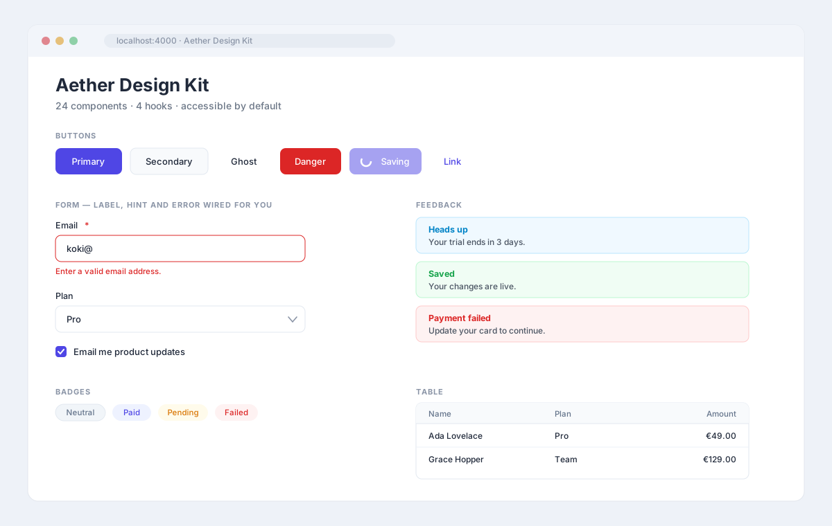
Aether Design Kit
24 accessible React + Tailwind components, sold as source.
Overview
Most UI kits are either a black box you cannot restyle, or a pile of snippets you have to wire up yourself. This is the middle ground: 24 real components whose accessibility is finished, driven by a single token file so rebranding the whole kit means editing twelve CSS variables — not hunting hex codes through component files. You get the TypeScript source, not a compiled package, so every decision stays open to you. Dark mode works from both an explicit toggle and the visitor's system preference, because supporting only one of those leaves half your users on the wrong theme.
Key features
- 24 components — buttons, forms, dialogs, tabs, tables, toasts and more
- 4 hooks — useDisclosure, useOnClickOutside, useFocusTrap, useMediaQuery
- Themed by CSS variables — rebrand the whole kit from one file
- Dark mode from a class toggle and prefers-color-scheme
- Focus traps, Escape handling and focus restore in every dialog
- Form fields wire label, aria-describedby and aria-invalid for you
- Arrow-key tab navigation with roving tabindex
- Toasts share one persistent live region, so screen readers announce them
- No runtime dependencies beyond React
Specifications
- Stack
- React 18 or 19 + Tailwind CSS 3
- Language
- TypeScript (strict)
- Components
- 24
- Hooks
- 4
- Dependencies
- None beyond React
- Licence
- Perpetual, unlimited projects
- Delivery
- ZIP with full source, instant download
€72.00
Perpetual license · one-time purchase, never expires
What's included
- Full TypeScript source — 24 components, 4 hooks, strict mode
- Design token stylesheet (light and dark)
- Tailwind preset mapping tokens to class names
- Next.js demo gallery showing every component
- Documentation — getting started, theming, component reference
- tsup build config for ESM + type declarations
- Commercial source licence — perpetual, unlimited projects